We laced up and sprinted into the redesign of the Runningman Festival website, bringing its high-energy, goal-smashing spirit to life online.
Whether participants are tackling a 5k or pushing their limits with a 50k, this ultimate wellness festival promotes endurance, achievement, and fun above all else. But the website? Lagging—and stuck at the start line. Our mission: To refresh the branding, streamline navigation, and inject the same excitement that fuels every runner on race day.
The original website lacked the pulse-pounding energy of the festival itself. Clunky navigation and inconsistent branding made it tough for users to find race details, register with ease, or feel the electric anticipation of the event day. It needed a serious boost—something bold, fun, and engaging to reflect the festival’s retro-meets-modern personality.
We took a multi-lap approach, refining the festival’s visual identity while boosting the website’s functionality and user experience.
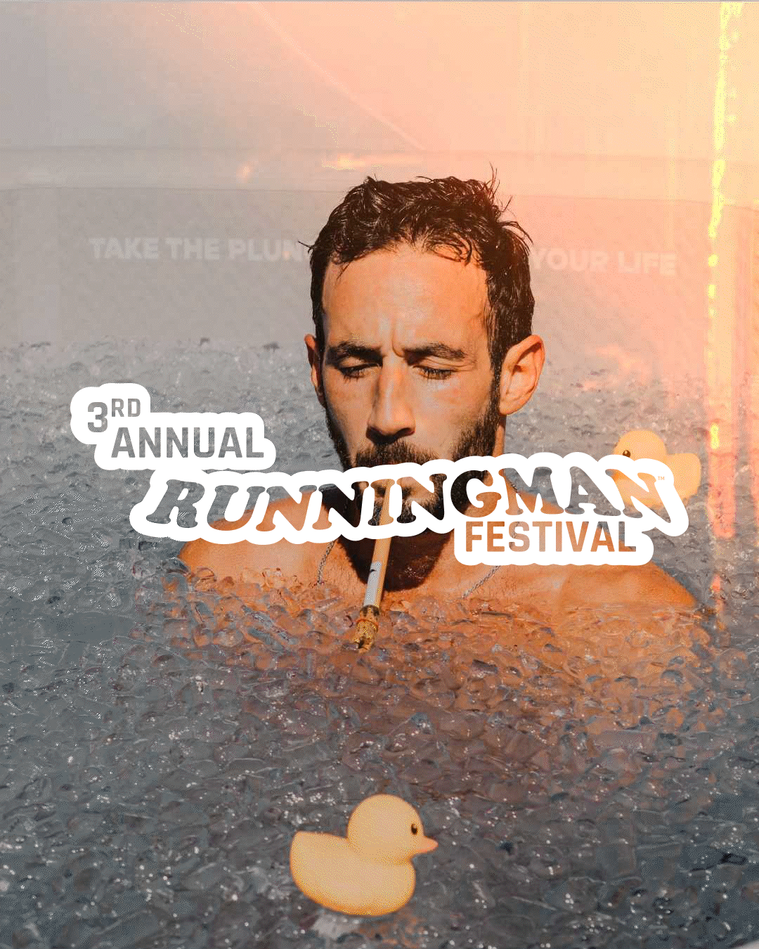
Branding That Goes the Distance
We reworked the color scheme, keeping the original palette but fine-tuning it for a more cohesive, high-impact look that hums with excitement.
SEO Optimization for the Long Run
We optimized content and technical elements, increasing search visibility so more runners could find and join the challenge.
Interactive, Playful Elements
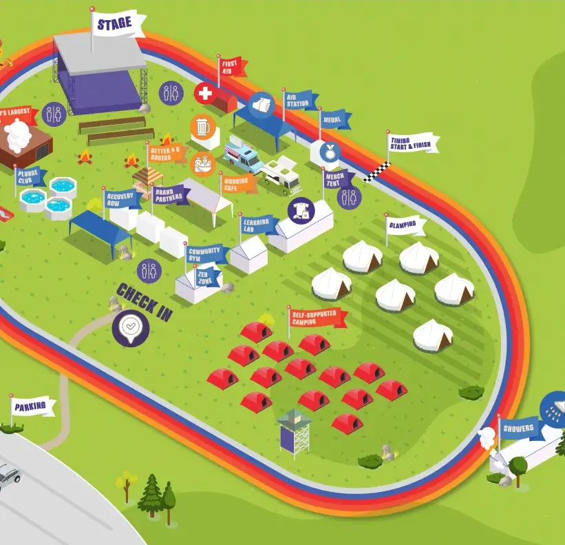
A standout feature? The 3D isometric festival map brings the event grounds to life in a fun and engaging way. Complete with detailed, isometric illustrations of real festival structures and activities, this wins.
The Grainy Gradient
To add texture and depth, we incorporated grainy gradient backgrounds—giving key sections a lively, energetic feel that perfectly mirrors the festival’s electric atmosphere.
A UX Sprint to the Finish
By restructuring the site’s layout, we improved navigation and accessibility. It’s easier for users to register, explore race details, and plan their perfect festival day now.
Retro Meets Modern Design
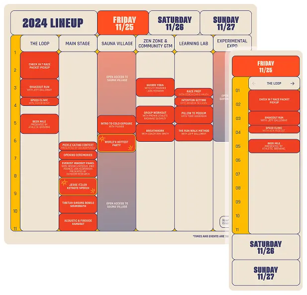
A fresh, retro-inspired aesthetic was woven throughout the site. The reimagined festival timetable, in particular, marked where bold, playful typography meets nostalgic, dynamic design.
Typography with Impact
We introduced a new hierarchy, using all-caps headings for emphasis and improved readability. We wanted every detail across the site to stand out with clarity and style.
The Runningman Festival website is now as dynamic as the event itself. With a visually engaging design, seamless navigation, and interactive elements, it fuels excitement, encourages participation, and captures the festival’s one-of-a-kind experience. Whether it’s a casual jog or an all-out endurance race, the site now reflects the passion and energy of every participant crossing the finish line.
Looking to refresh your brand’s digital presence with the same energy and impact? Poirier can bring your vision to life—no sweat.